Using Colour Theory in Range Planning
All of FAUN’s collections play with colour to create depth and interest. The most recent Autumn/Winter collection is a perfect example of this.
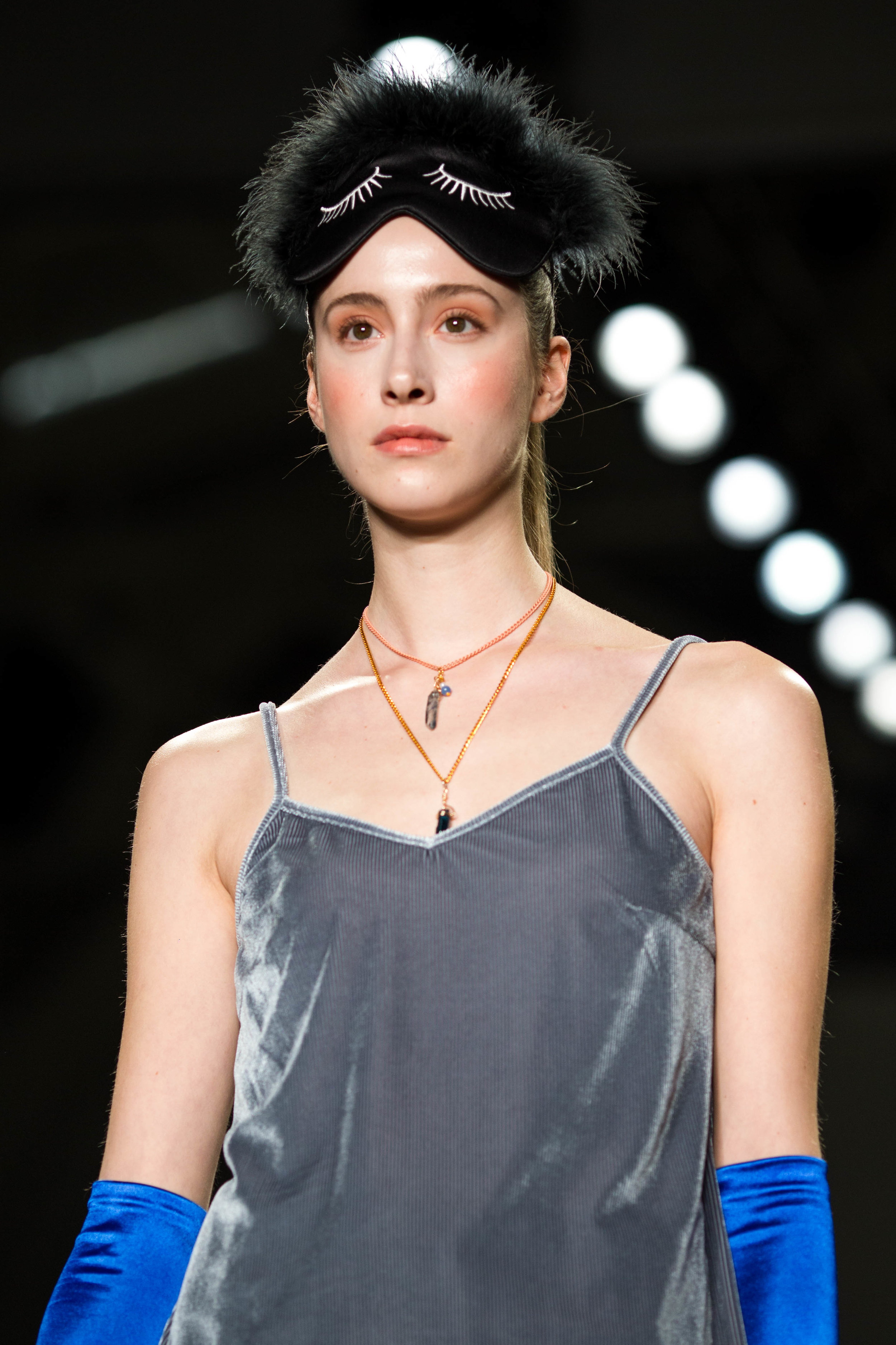
As a painter, I have always used the colour wheel to plan each range. In the AW1920 collection, seen at New York Fashion Week in February and to be shown at Vancouver Fashion Week, colours have been seamlessly combined in order to create a seamless look.
The collection begins with shades of blue, specifically cobalt, contrasted by pinks, greys and blacks. I used the textures of natural elements, like furs and feathers, to deepen the monochromatic looks.
Next, I decided to bring in shades of the next primary colour, red; blue’s perfect compliment. The red pops against both darker and lighter shades. Again, texture is an important component when contrasting there different variations of the same colour.
The collection ends with FAUN’s signature feminine palette, playing with muted shades of pink and green. These final looks are feminine, yet bold. Normally, people shy away from pair warm toned burgundies and pink with cool toned green, but these looks are a perfect example of how to make them work.


